Concepting - Logo's
What did I want to do and why
Our group project started with one goal: to build a brand from the ground up.After some brainstorming, discussions, and a lot of back-and-forth, we finally landed on a name that felt right, FLUX.
The word captured exactly what we wanted: movement, transformation, and creative energy.
What did I do and what was the result
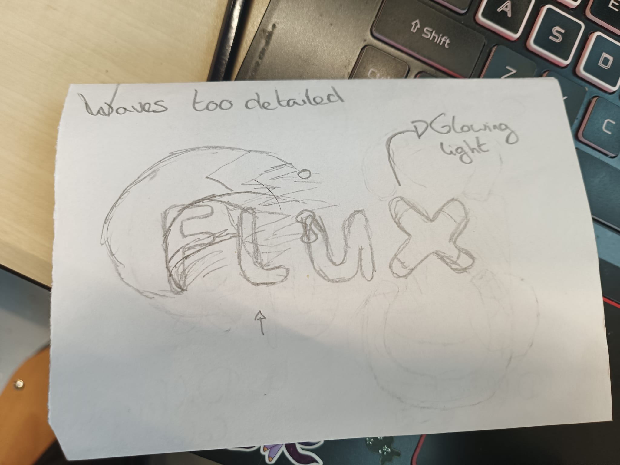
Concept Sketching:
I grabbed a piece of paper and started sketching, sometimes the best way to test an idea is to see it right in front of you.I wanted to visualize the logo and get a feel for how it might look for our branding.
Sharing the sketch with the group helped us see if the concept was appealing and heading in the right direction.
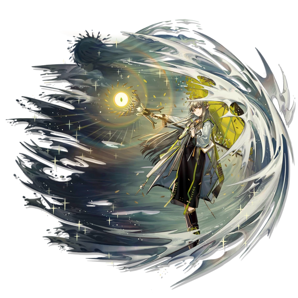
The inspiration:
This character is from the game Arknights, a strategic RPG tower defense game known for its rich world, building and futuristic aesthetic.I chose this character as a reference because their background instantly reminded me of water, flow, and advanced technology themes that aligned perfectly with the concept I was working on.
The fluidity in their design and the high-tech elements felt like a perfect match for the visual direction I wanted to explore.
The sketches:
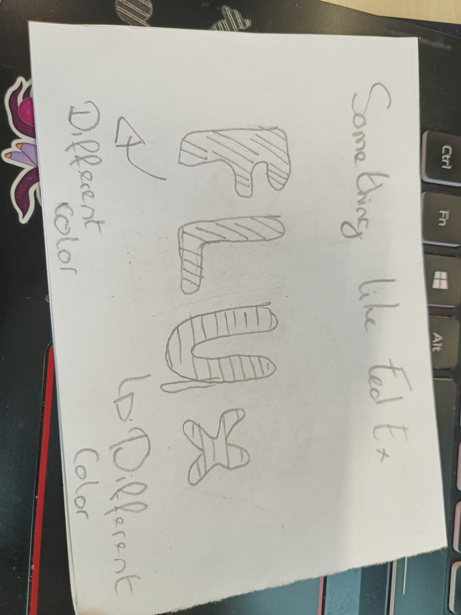
This is another early sketch of my logo concept for FLUX.
I was inspired by the FedEx logo, especially its clever use of color contrast and hidden meaning.
I wanted to bring a similar layered depth to my design.
Each letter in FLUX is drawn with a bold, rounded shape to give a modern, approachable feel, while still hinting at movement and fluidity.
I planned to use different colors for each letter (as noted in the sketch), not only to create visual interest but also to symbolize variation and change, core ideas behind the name FLUX.
Though still rough, this concept plays with simplicity, form, and visual, much like the FedEx logo, while adding a unique personality and sense of flow.
Logo's digitalized
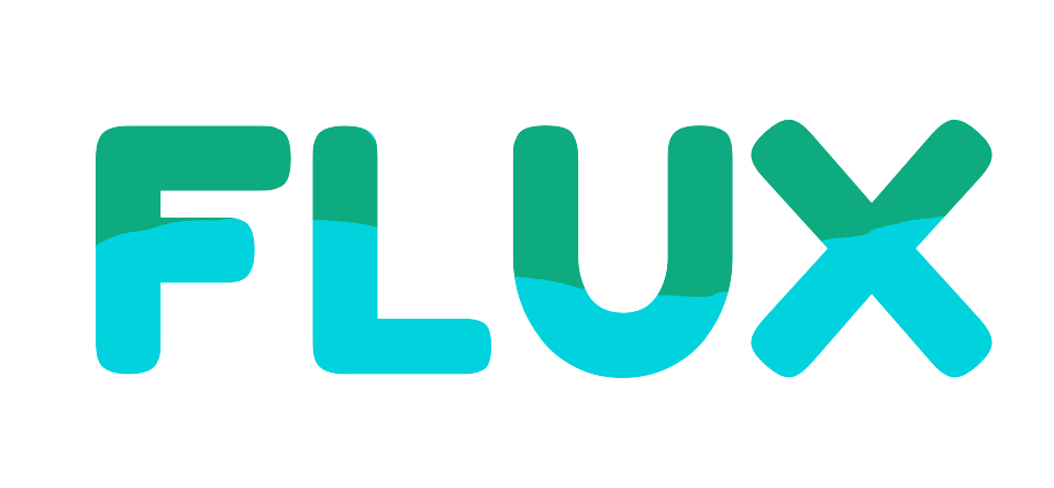
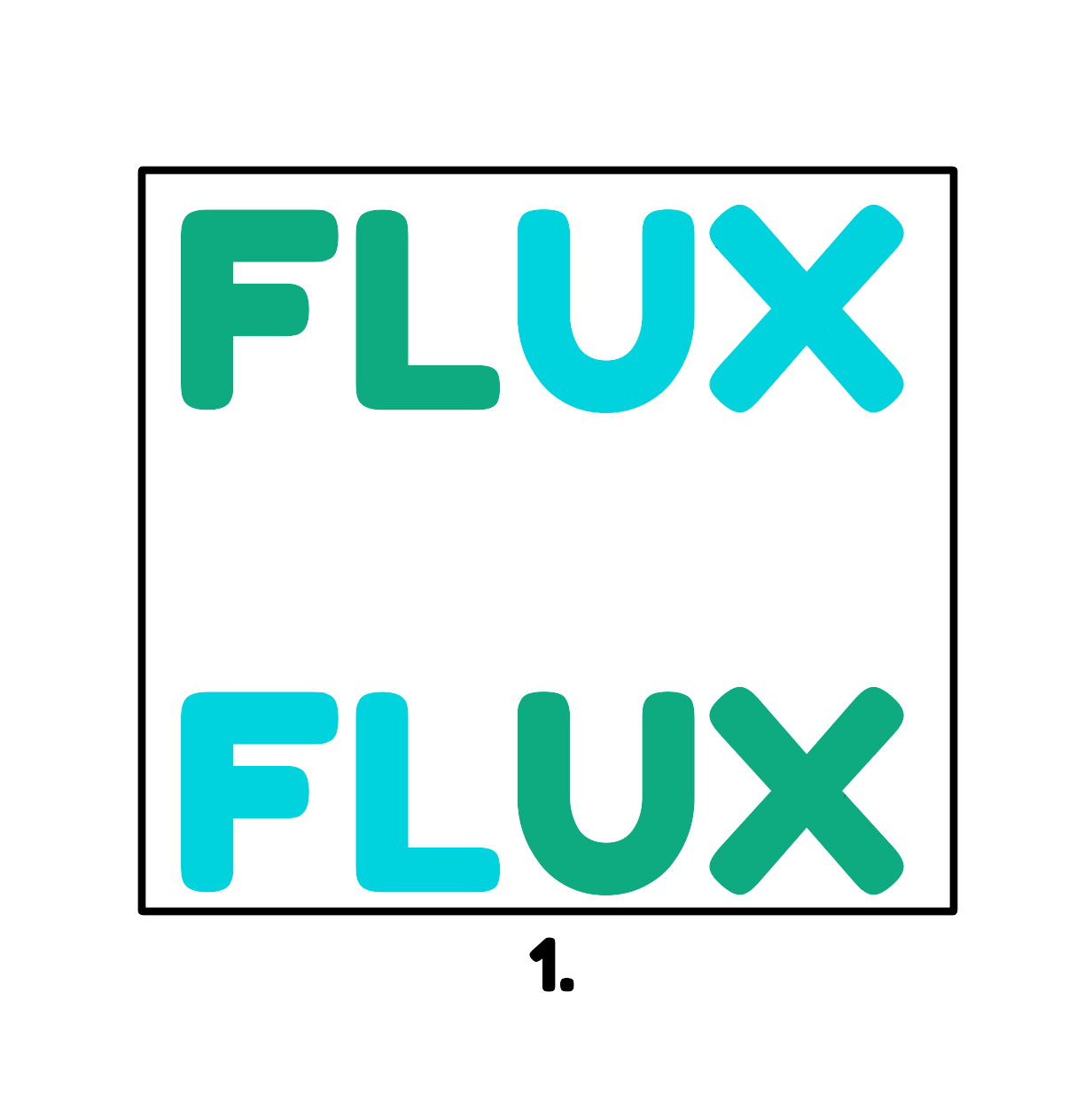
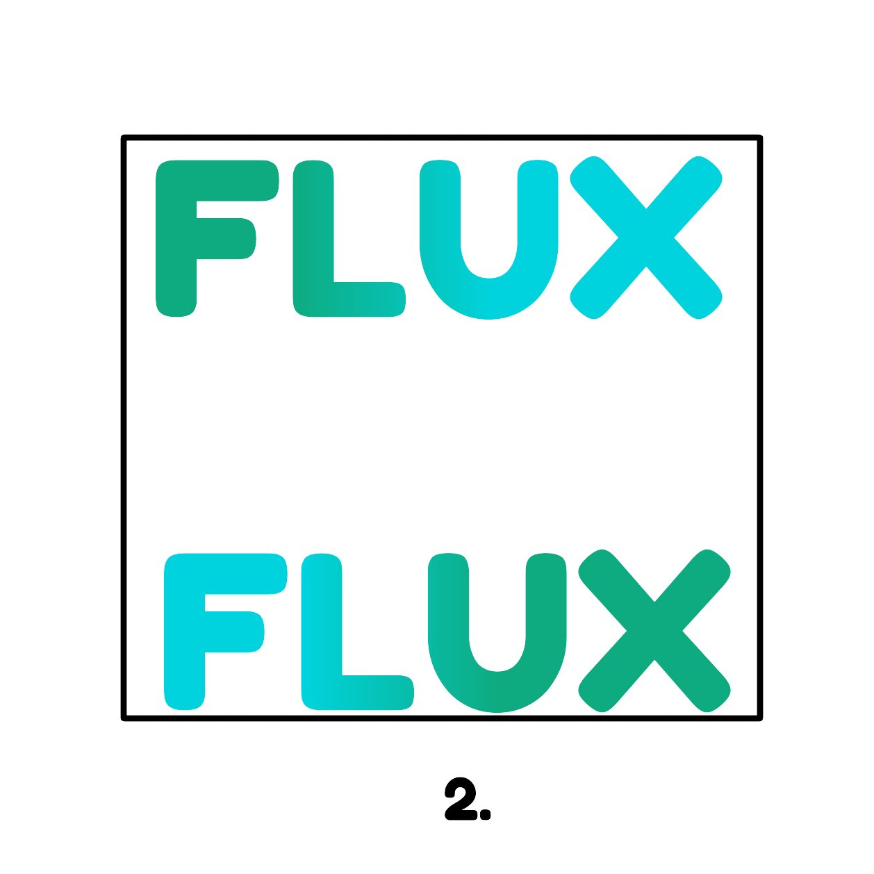
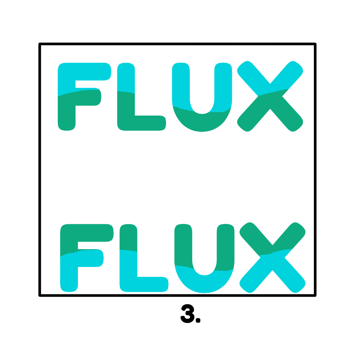
In itteration photo 3. The style of the waves is being used in the current design
What will I do next
I will be continue the concepting in the near future, but this isnt my top priority right now. It would be filling up the (temporary) portfolio and it will be concepting my portfolio website in stead.I will also do some Itterations on the logo's with colors but that will not be focused too much.
How did we validate it/feedback
I went to Chris and Medhat for feedback of the concepts that we have made for the logo's.Chris - It was more feedback aimed to the whole group project overal.
Feedback: Validate it through User test
Medhat -
He was impressed by the steps I took to create the concepts and by how I explained the reasoning behind each step.
He did offer some constructive criticism, noting that the logos were too much like plain text. He suggested trying something bolder, as there's nothing to lose by experimenting. He also recommended exploring ideas that aren't strictly tied to the theme, like using something unexpected, such as a flux capacitor, for example.
Small Table of Contents
Evidence description
LO1 - Conceptualize, design, and develop interactive media
products
Conceptualizing the Logo's
LO3 - Itteration
Adjusting the logo designs to match our group's preferences and
feedback.
LO4 - Personal Standard
CMD methods
Library: Trend analysis
Workshop: Sketching
Showroom: Peer review
Using the logo for the brand guide